Making Food More Fun with OpenTable:
There's no accounting for taste. To help users find reviews and reviewers they can have a higher level of trust in, myself and another designer partnered together to ideate about ways to improve the current OpenTable review experience. We wanted to create a greater sense of community and, therefore, trust in what users could come to expect from the app and convert to more bookings because of that newfound confidence.
There's no accounting for taste. To help users find reviews and reviewers they can have a higher level of trust in, myself and another designer partnered together to ideate about ways to improve the current OpenTable review experience. We wanted to create a greater sense of community and, therefore, trust in what users should come to experience from the app and convert that trust into more confident bookings.
Helping {brand} improve their {experience}.
No more complicated workflows. Just write your case study and publish. That's it.
Role
User Research
Product Strategy
UI Design
Interaction Design
Usability Testing
Tools
Figjam
Notion
Maze
Figma
Timeline
4 weeks
The Problem
Users hoping to gain confidence and get excited about their booking decisions do not have enough information from the current reviews system. Trust is not easily established when recommendations come from mostly anonymous users.
The Solution
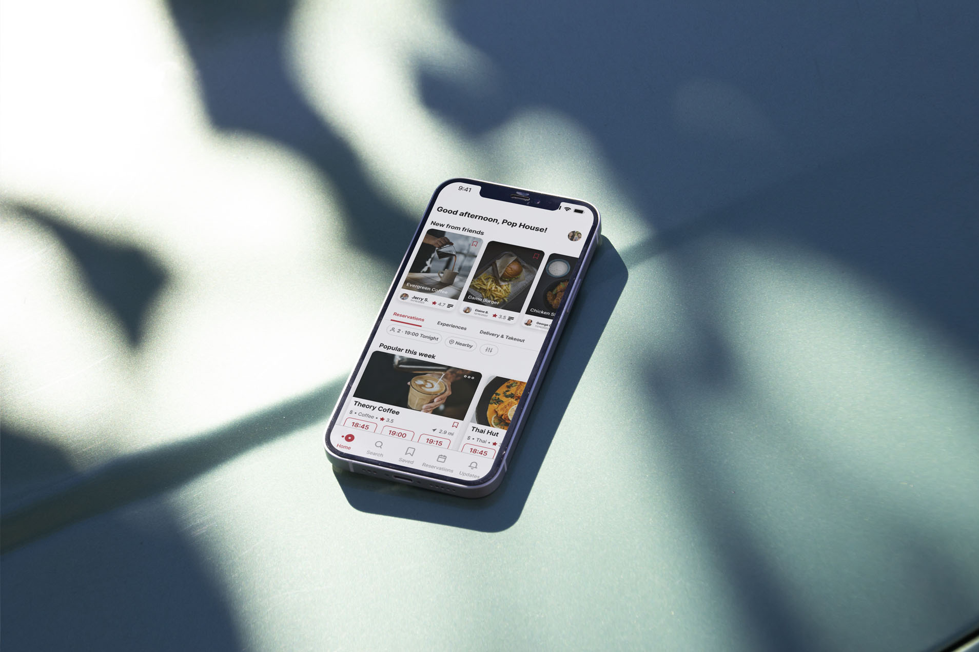
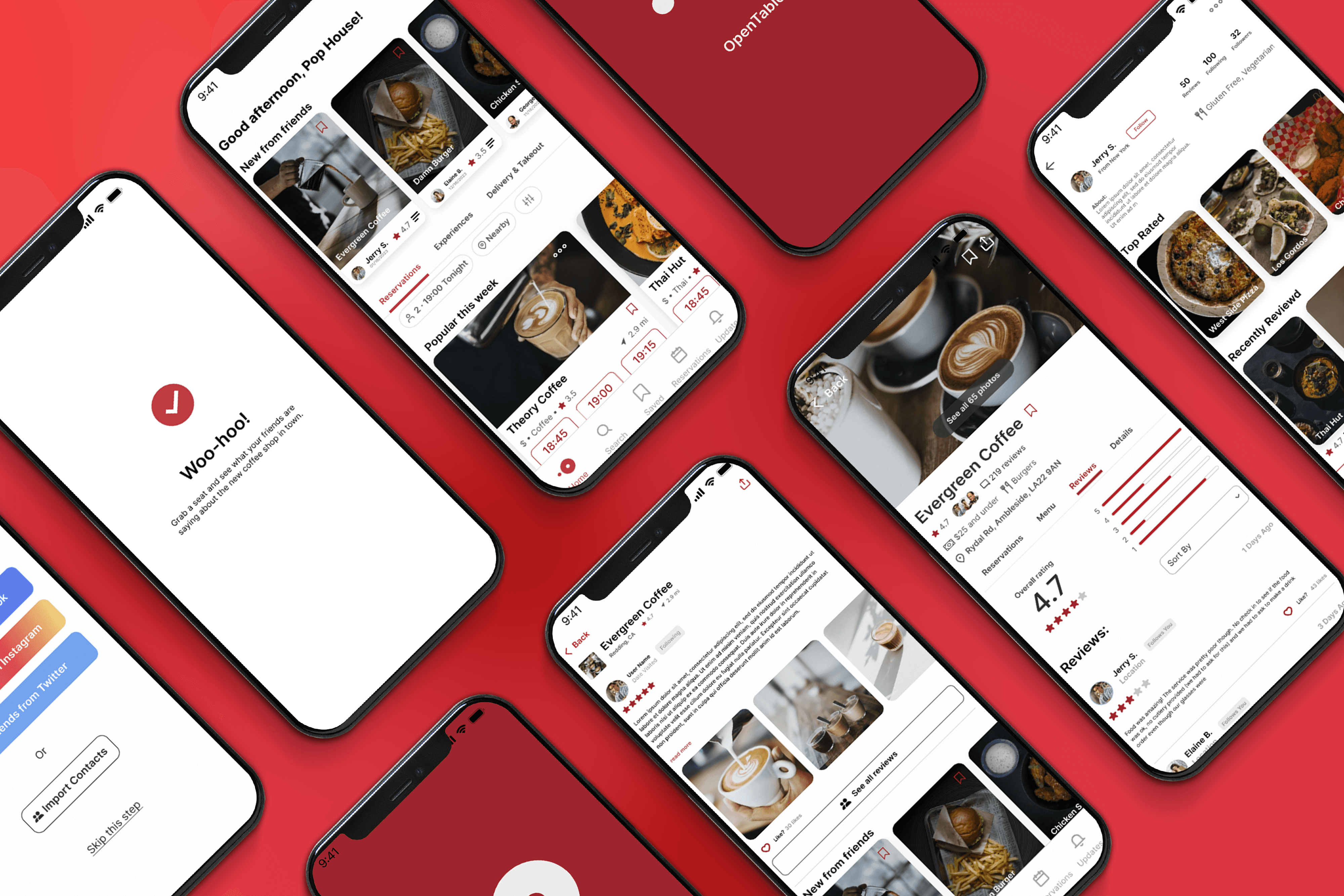
By creating a social interaction component users are able to find and follow friends who have similar sense of taste. We made friend review cards and made them prominent in the app to give users instant and more reliable review content. We also gave more attention to specific user reviews by giving them their own page within the app when clicked.
Usability Review
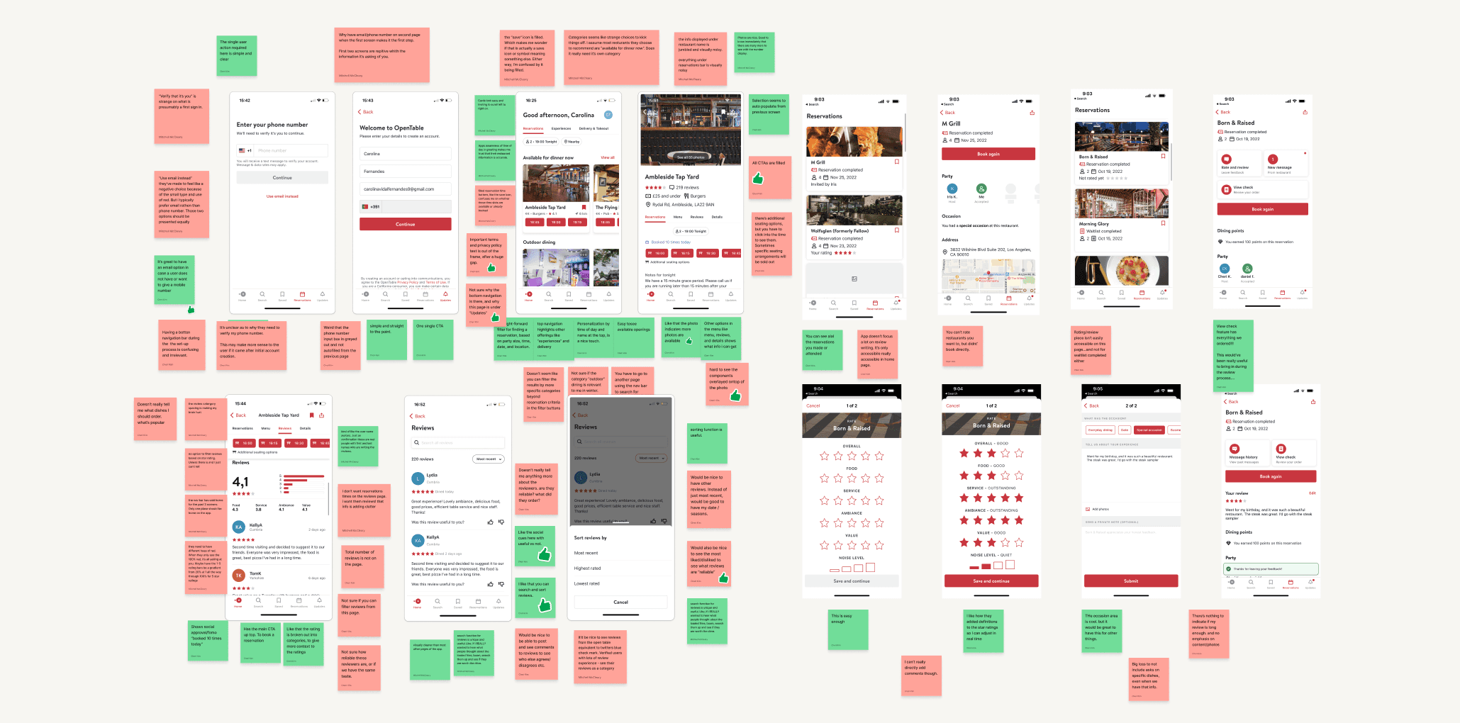
To begin we conducted a usability review and identified pain points and wow moments in the existing product. Our main goal with this step was to empathize with new users— focusing on what it's like to find, read, write and interact with reviews. To take it a step further, we also booked a table and wrote a review using OpenTable to see what the process was like start to finish.
To begin we conducted a usability review and identified pain points and wow moments in the existing product. Our main goal with this step was to empathize with new users— to focus on what it's like to find, read, write and interact with reviews. To take it a step further, we also booked a table and wrote a review using OpenTable to see what the process was like start to finish.
Business & User frustrations
Summarise the business and user frustrations…
Having identified both the pain points and wow moments, we then synthesized that information to identify the primary and secondary frustrations for users.
Primary Frustration
When [situation] users are [response] which results in [problem to business or user]
When searching for high quality and relevant reviews, users have no way to know if what they are reading is trustworthy which results to less confidence - and therefore less frequency - in bookings.
Secondary Frustration
When [situation] users are [response] which results in [problem to business or user]
When users are looking to follow reviewers whose content they enjoy, there is no way to conveniently make those social connections which leads to less consumption of product content. Which leads to less consumption of delicious meals booked through OpenTable.
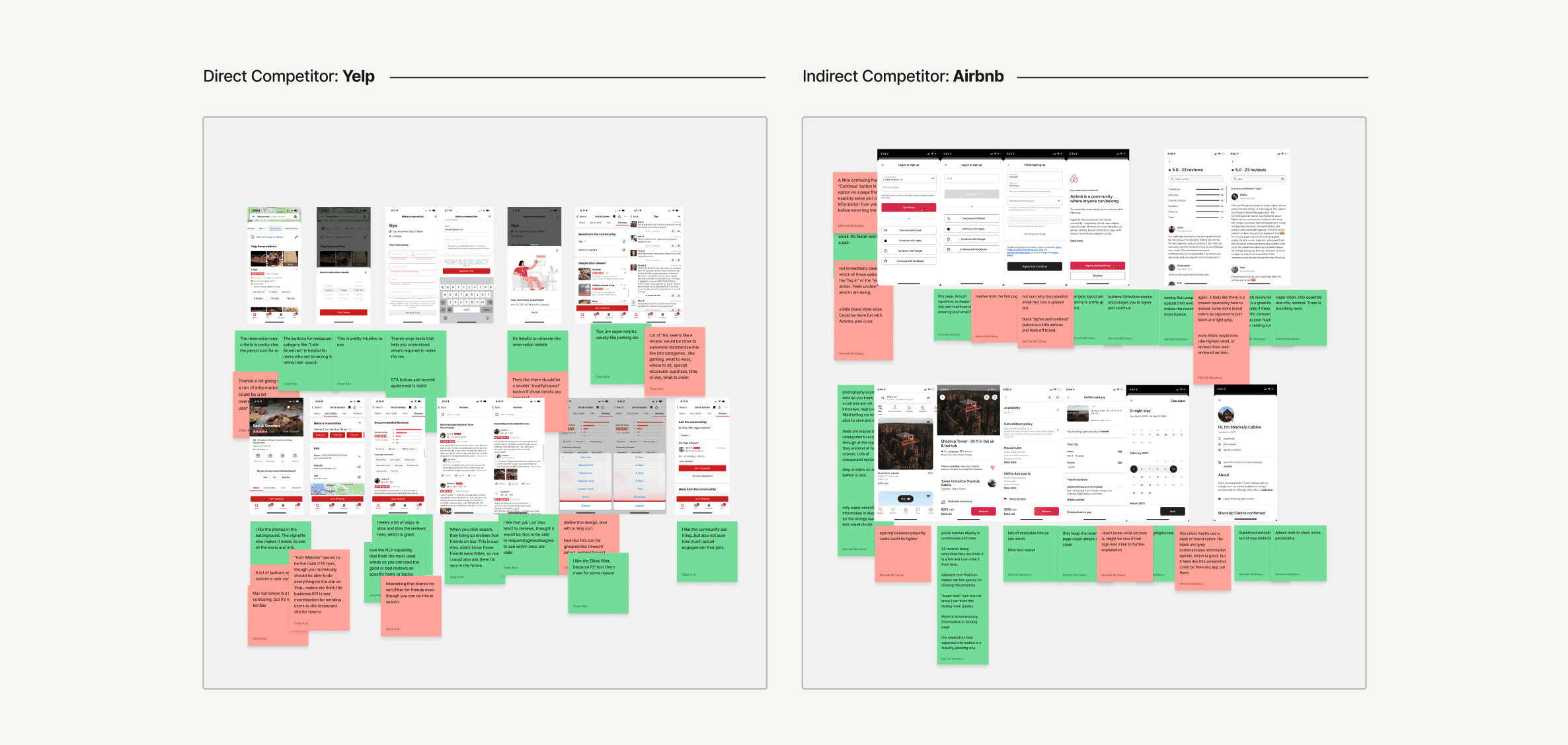
Competitor Benchmarking
Summarise the competitor benchmarking…
After completely our usability review, we moved on to competitor benchmarking to identify standards and solutions from both indirect and direct competitors that might be used to improve the existing experience. We focused on six key metrics to help draw unique comparisons and insights from each competitor: strengths, weaknesses, content, design, UX and opportunities.
Problem Space
Summarise the problem that you've identified and why you've formed a how might we question…
Following our research we jumped in to define the problem space to help us better focus our energy on a potential solution for users and business.
We found new and returning users looking to learn more about a restaurant before booking may feel a lack of confidence in the current reviews system. Not knowing if other reviewers have similar taste as them results in lower trust levels for reviews. The current review system has no social component, There is no way for users to give more weight to quality reviews and reviewers. It is important for users to have ways to trust the content they consume, whether it be a meal at a five star restaurant, or a well liked and thoughtful review.
How Might We…
How might we help users discover reviews, and therefore reviewers, they trust?
Ideation
Summarise the ideation phases that you followed…
To explore ideas collaboratively we conducted a series of ideation techniques. We started with “Crazy 8’s” using time as a constraint to generate quick, judgment-free ideas. We then built a mind map to expand on those ideas and differentiate between which ideas were improvements and which would be additions.
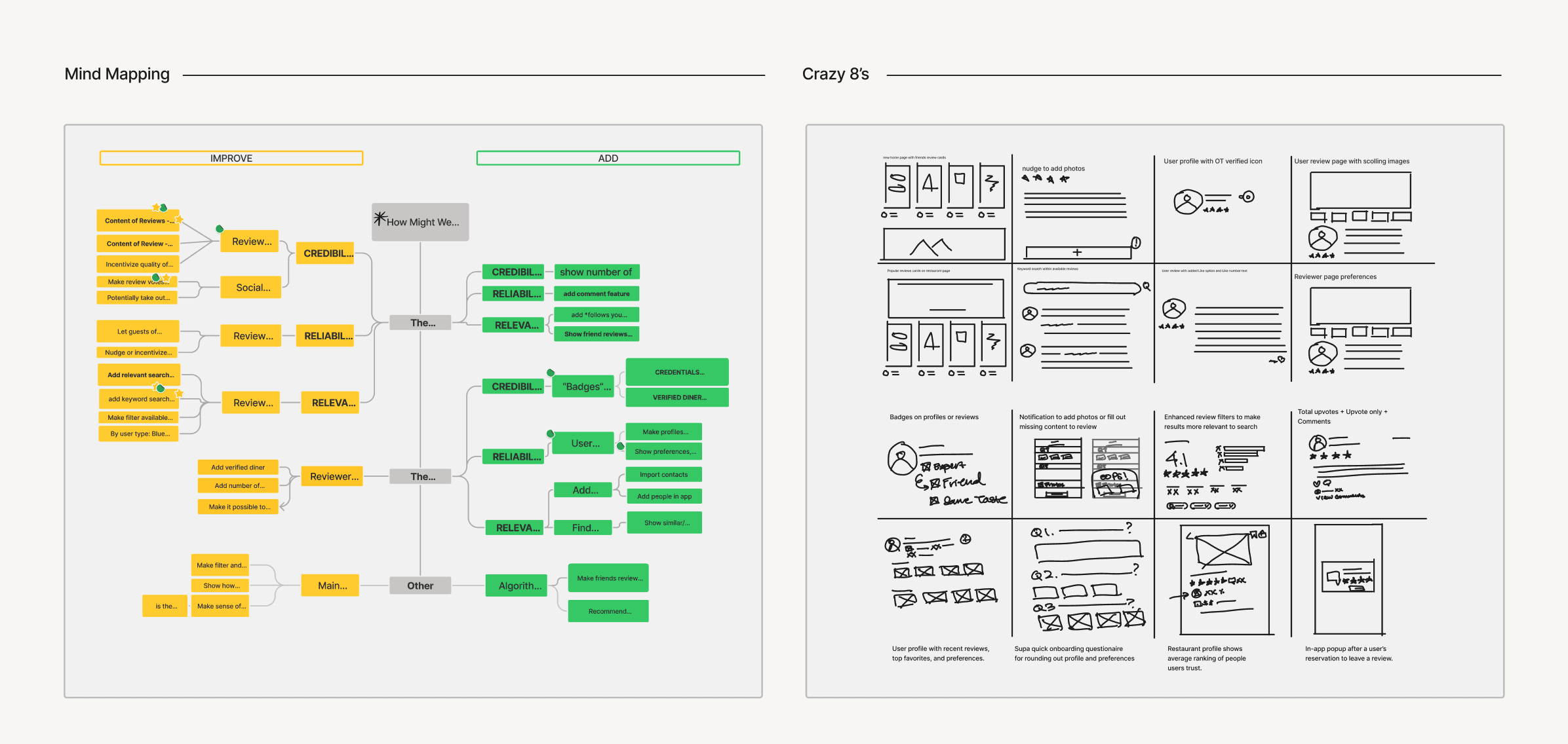
What can we add
Enter the highest priority idea that you identified we could add
We determined the highest priority idea we could add was the option for users to see reviews from 'friends' immediately when opening the app.
What can we improve
Enter the highest priority idea that you identified we could improve
The highest priority idea that we identified we could improve was to make writing a review a more pleasant experience.
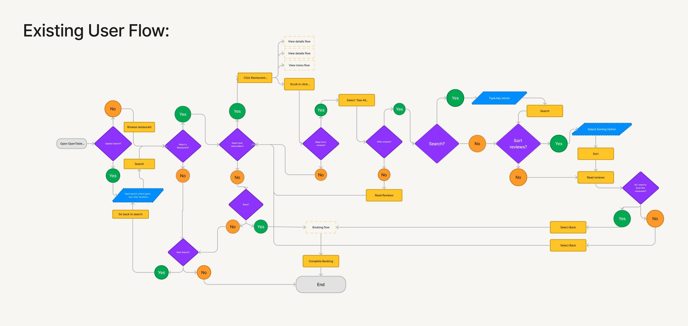
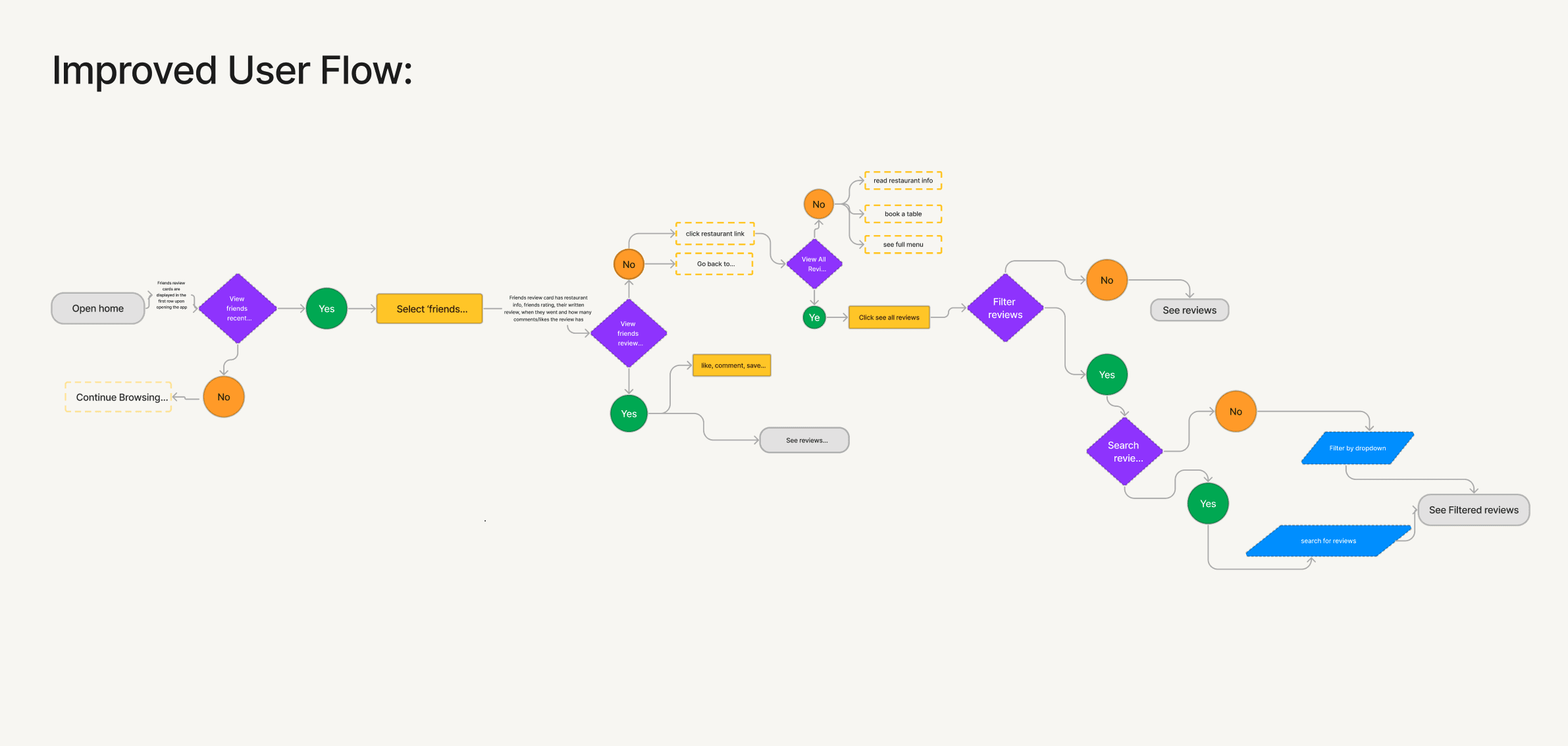
User Flows
Summarise the user flows that you mapped and improved…
Following Ideation we mapped out user flows of the existing experience and improved the flow based on the ideas we selected which fit with business and user goals.
Our key improvement is in minimizing the actions needed from Home Screen to quality reviews. Instead of having to search out a restaurant and then combing through a series of randomized and other wise anonymous reviews, we decided to add review cards from people you follow to the homepage. We created a friends activity 'feed' with the goal of getting users well 'fed'.
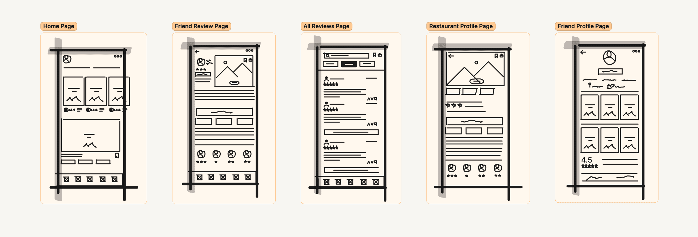
Rapid Prototyping
Summarise the rapid prototype that you created…
After mapping our improved user flow we spent time rapidly prototyping a solution. Sketching helped us quickly iterate on the original idea and begin to visualize a solution without sinking time into hi-fidelity screens prematurely.
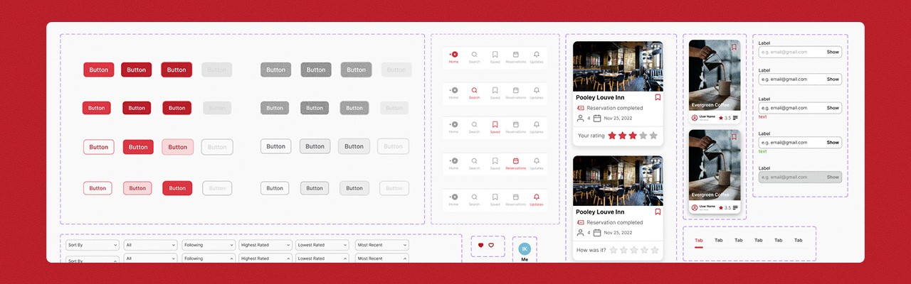
Styles & Components
Summarise the styles & components that you created…
Before creating the hi-fidelity prototype we created the product styles and interactive components in Figma to ensure an efficient and consistent design. Establishing styles and components helped us save valuable time when building our hi-fidelity prototypes.
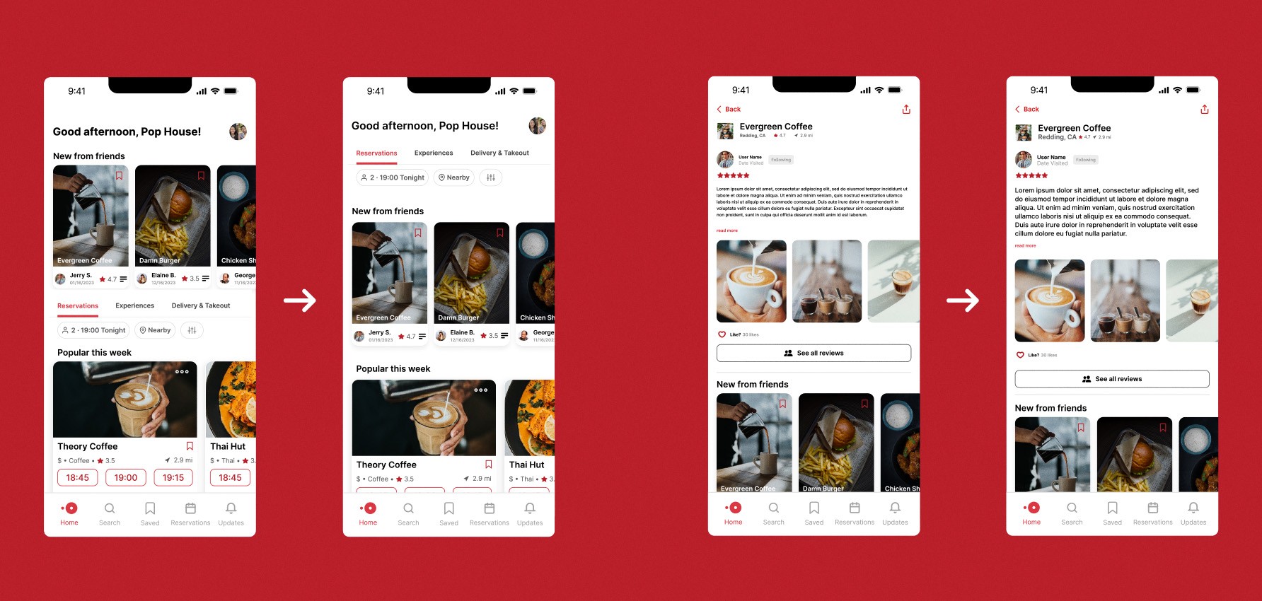
High Fidelity Prototype
Summarise the final prototype that you created…
Our hi-fidelity prototype demonstrates a call towards immediate social connection. We invite users to import contacts through other social applications as a way to quickly add friends to their profile. We then show what an updated Home Page would be like if activity from friends was the first thing users see when opening the app, as display through friends review cards. We also created new user profile pages, and gave each specific user review its own page for breathing room.
Usability Testing
Summarise the usability testing script and test that you created…
To gain insights from usability testing, our team asked friends to try out our prototype through Maze and we also asked testers to react to our high fidelity prototype in Figma.
Test outcomes
Having tested the prototype, I learned [Insert key learning] which should improve [insert business goal] and [insert user benefit]
Having tested the prototype, we learned that users quickly wanted to engage with the new, updating content they saw from the people they follow, which should improve their confidence in booking a restaurant through OpenTable. It also made users want to spend more time on the app than they had previously.
We also received some constructive criticism from our user testing. Feedback about the app feeling a little cluttered with information blocks on the home page led us to improving the white space and breathing room. We also increased font sizes on all pages as some users expressed some accessibility issues from the smaller font sizes used initially.
Three key learnings
1. Enter first key learning from this case study
1. Finding ways to establish trust for users results in more confidence decision making.
2. Enter second key learning from this case study
2. User Feedback is more important than a 'perfect' design. We design for people, not ourselves. The earlier, and more often, you can bring users into the process, the better the design becomes.
2. Enter third key learning from this case study
3. Humans make humans decisions. It's much easier, and more pleasant, making decisions from a place of human connection than it is based on an algorithmic push.
Next steps
Explain the next steps you would take if you had more time to iterate
While the results from our usability test included many positive outcomes, they also presented opportunities for me to learn where further iterations to the experience could be helpful. Things can always get better!
If I were to iterate further on the app based on these results, we would concentrate on further building out the 'friends' component of the app. Improving the review page experience, better implementing video and photos to reviews, and building out the possibilities of the users profile page.